Task 4: Manual Scripts and Potato Printing
- Karen Wang
- Oct 3, 2021
- 3 min read

For this week’s task, I decided to make two potato stamps. The first step for me was to come up with a five-letter word that doesn’t have the same letters. I put in “five-letter words” in the google search engine and decided to use the word: emoji. Then, I studied the video and jotted down all the steps on making a potato stamp.
Without much consideration, I cut a potato in half and used a metallic marker to sketch the word on both halves. As I was writing the letters, I had to constantly press the potato on a paper towel to soak-up moisture from the surface of the potato. After that, I started carving the potato with a dinner knife. I went around the letter slowly, yet it didn’t occur to me that carving around the letters would not make the letter hollow and pop out. As I realized that, it was too late, and the carving became a thin piece of cut out 2D letters instead of a 3D pop up stamp.

After the first failed attempt, I began to wonder about the font that I chose. Initially, I chose the font Arial. Later, however, it occurred to me the letters had to be hollow in order for me to carve better. So, I went with STcaiyun and sketched the new font on to the potato.


This time, the carving process was a lot easier as I was able to recognize which part needed to be hollow, whilst carving around the letters. It was challenging to move the knife around the potato, and I had to constantly press the surface of the potato on paper towels to soak up the moisture. The moisture made the ink lighter and harder to see. After the carving was completed, the letters were pop up and it started to look like a real stamp. I painted the letters and pressed it on a piece of paper. This is when I realized that I made another mistake. The letters on the potato should be the opposite to what you need on the paper.


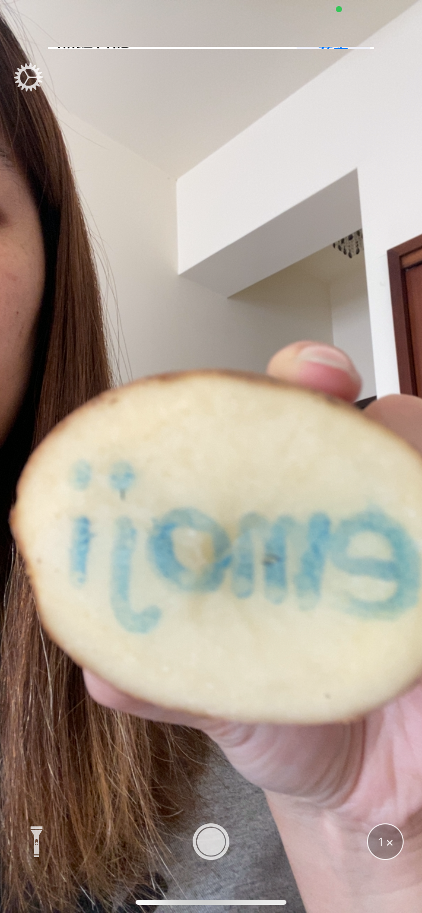
To overcome this problem, I used the mirror App on my phone and took a screen shot of myself holding the potato.

With the letters showing backwards, I could copy the letters onto the potato and applied the font from the earlier experiment.

In this third attempt of making the stamp, I realized there were many difficulties along the way. First, the five-letter word I chose; since both the lower-case letter “i” and “j” have a dot on top of the letter, it made the cutting process challenging, as the dot can easily snap from the rest of the body. The letter “j” wasn’t particularly easy to cut either. As you can see from the picture, I accidently snapped the bottom of the hook for “j” which looked like two “i”s. The letter “e” had a wrong opening, it should have been facing the left as opposed to the right. As Bolter (2001) stated “each new technology claims to be better than the one it sets out to remediate in at least one”. During the process of making the stamps, I encountered multiple problems and every time I had to come up with solutions to resolve the problem. I can associate Gutenberg when he invented the printing press technique, he must have also gone through trials and errors which later made press printing more systematic. While technology of mass printing made knowledge accessible for the public, the mechanization of writing is different than handwritten letters. As an elementary school teacher, I have observed that younger students often have confusion when it comes to seeing various fonts, especially students who are beginner learners. The letter “a” looks different than the handwritten version, therefore, students are confused when it comes to recognition of the letter and when learning how to write it. The same problem occurred in my Mandarin class, as students were confused between typed font and handwritten font and they often refer to the letter fonts they are unfamiliar with, the wrong letter or character. As we can access more knowledge and information, we should teach students to have a growth mindset and open their eyes with more possibilities.
References
Bolter, Jay David. (2001). Writing space: Computers, hypertext, and the remediation of print [2nd edition]. Mahwah, NJ: Lawrence Erlbaum.

Comments